Logo Design
Something I’ve always been totally fascinated by is typography, and during my years in school I did a project that was a virtual map. I took a photo of everything I saw on the bus to school, and then from the linear shapes within the shadows, the people, the structure, I then created a block based alphabet. Then I posed inside the alphabet and created a visual map of my journey to school. I have no idea really what I was thinking but it was one of my favourite first art projects.
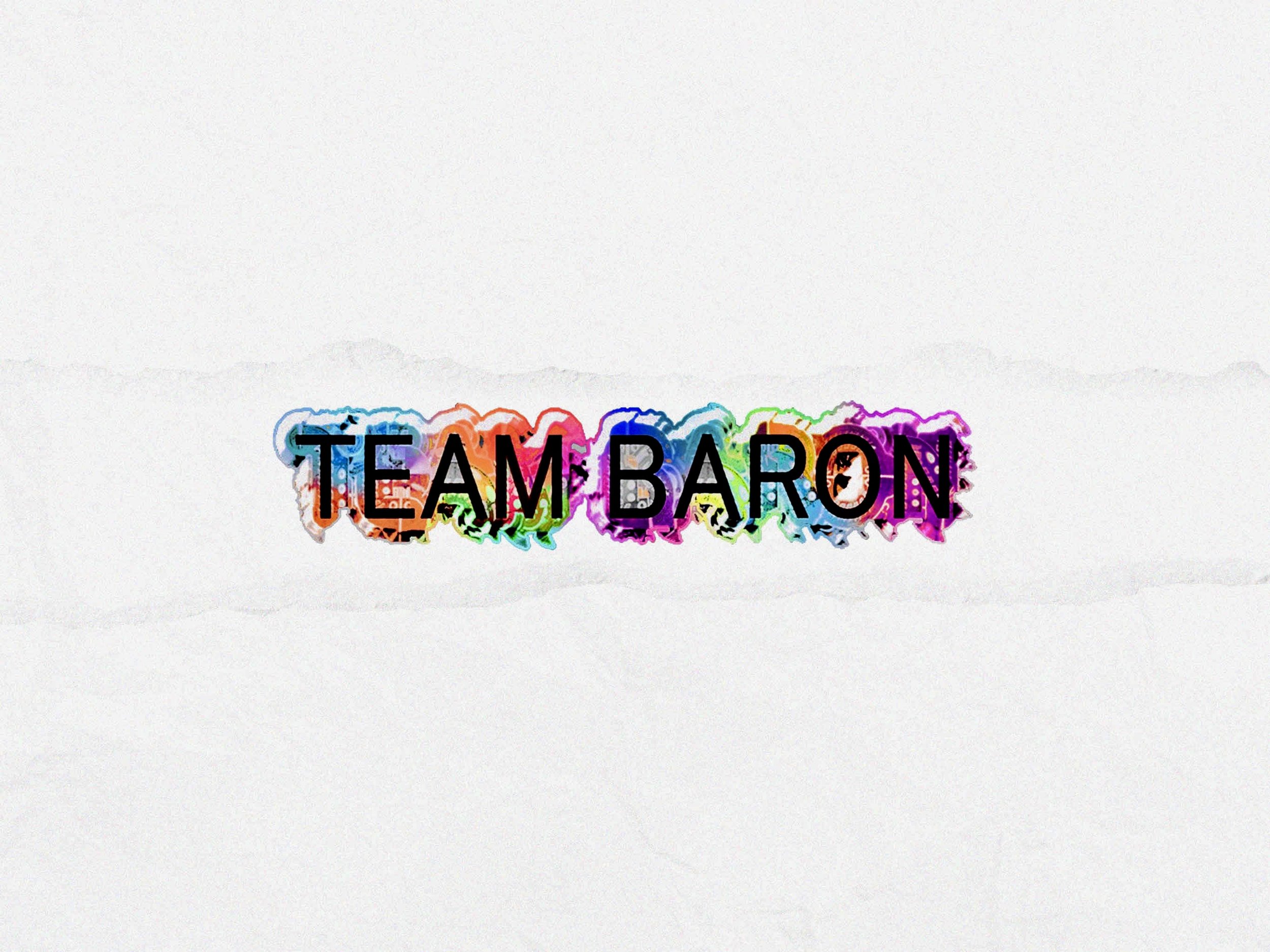
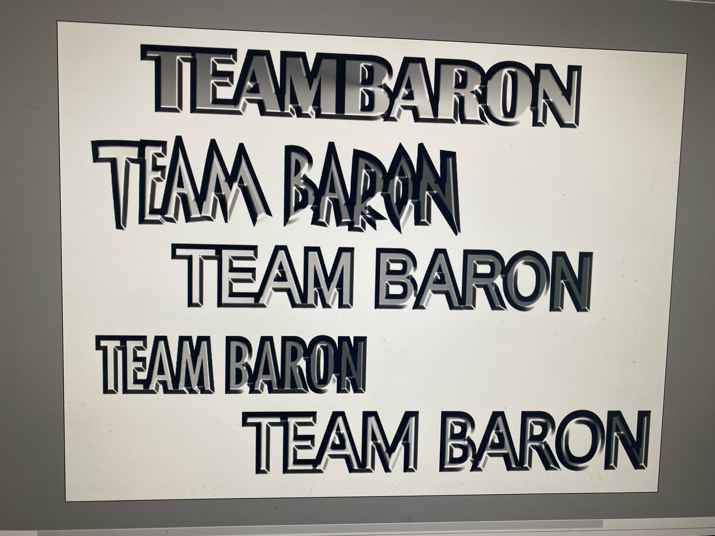
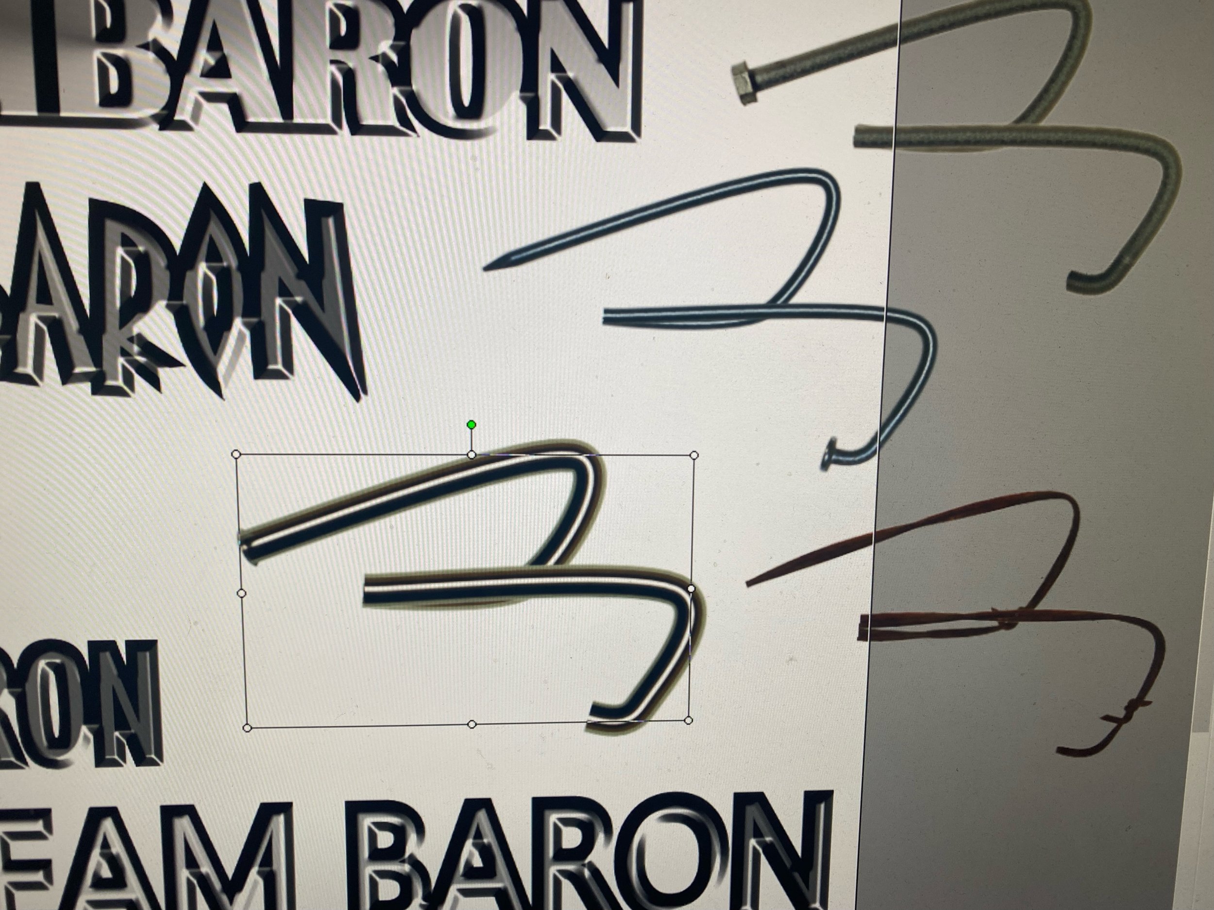
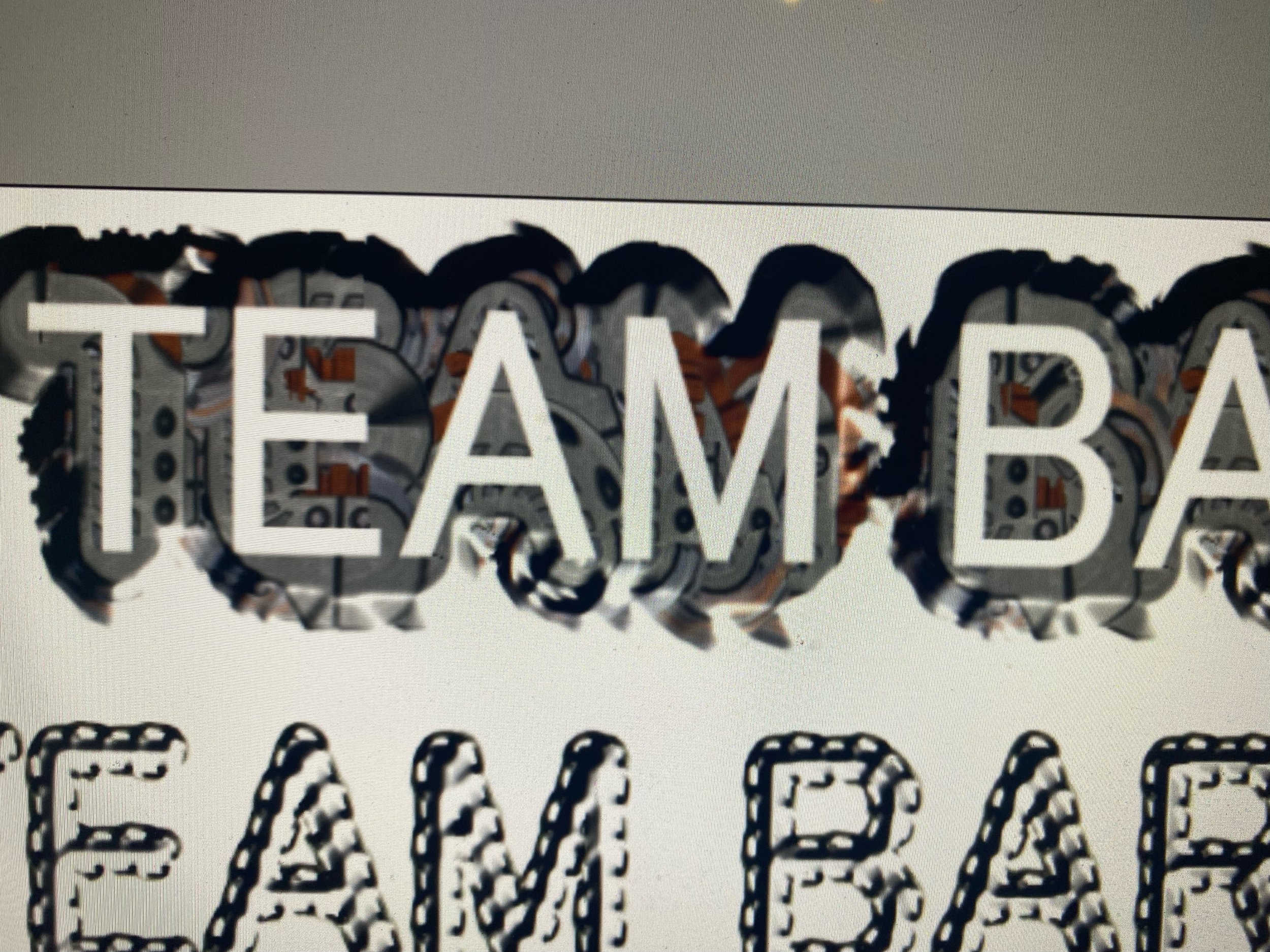
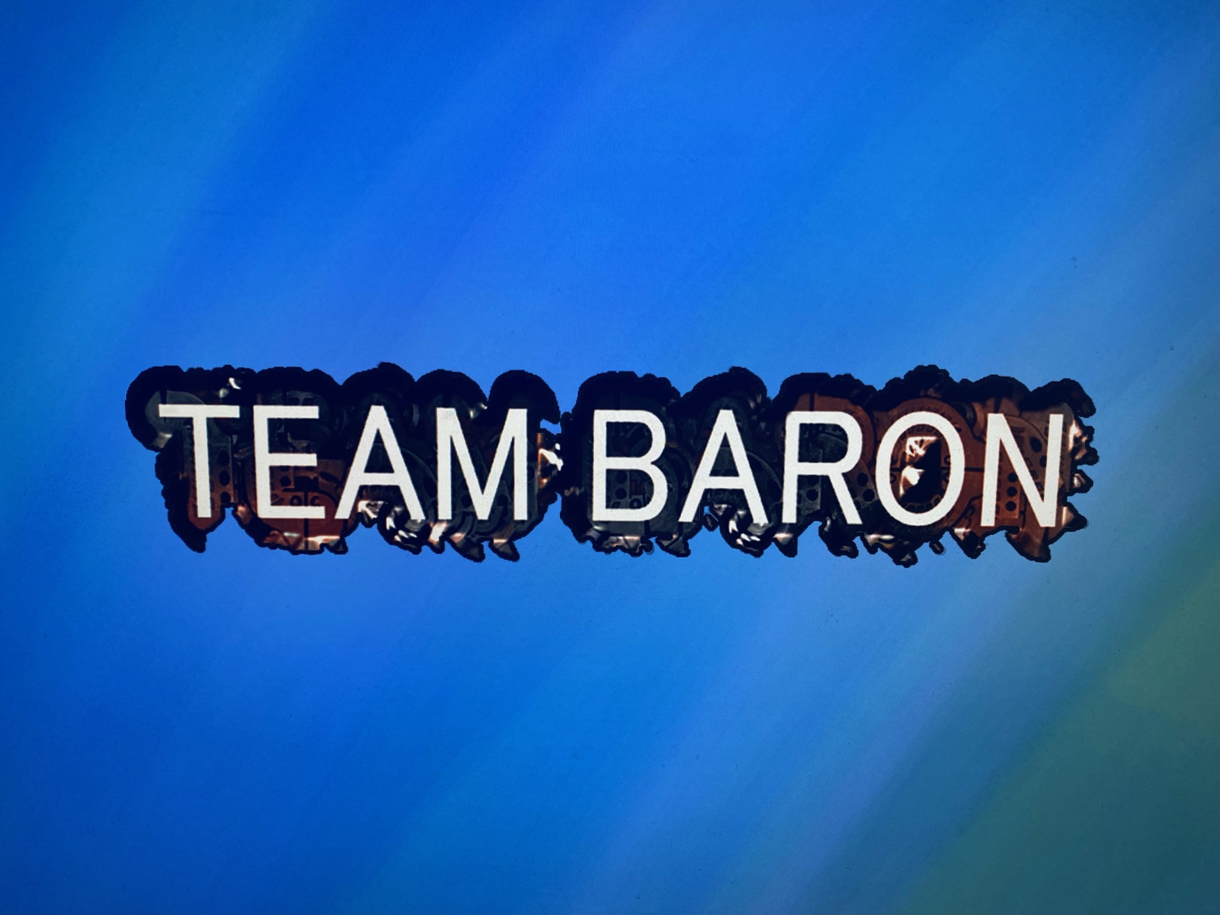
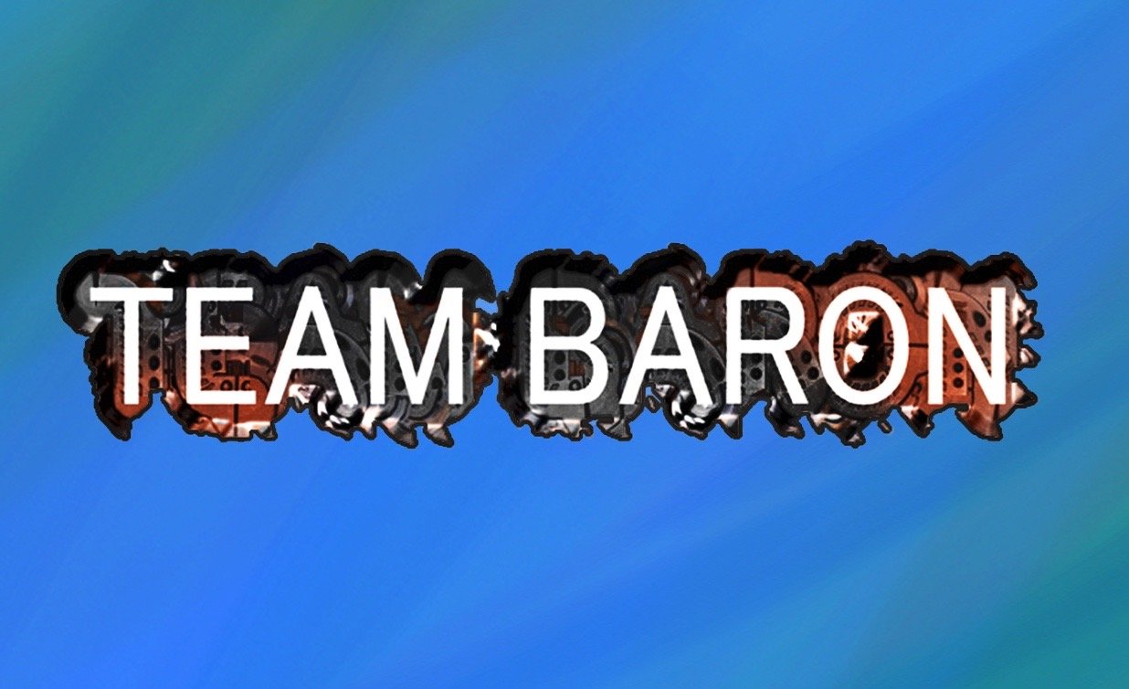
When I start designing logos, I tend to come up with a visualisation in my mind of the concept and then I see colours like an aura, I then sketch that out and it brings me into a space where I can figure out the style of what I wanted to do. Team Baron Productions is basically like an organic machine that’s been formed from all the things I do creatively, with the knowledge of the Baron. It’s a production studio and offers services to businesses, I wanted it to share my signature colourful approach with the concept of a machine. Here’s some of the play texts and shapes I came up with.
